For "mid.importance" objects, ggmid() visualizes the importance of component functions of the fitted MID model.
Arguments
- object
a "mid.importance" object to be visualized.
- type
the plotting style. One of "barplot", "dotchart", "heatmap", or "boxplot".
- theme
a character string or object defining the color theme. See
color.themefor details.- terms
an optional character vector specifying which terms to display.
- max.nterms
the maximum number of terms to display. Defaults to 30 for bar, dot and box plots.
- ...
optional parameters passed on to the main layer.
Details
This is an S3 method for the ggmid() generic that creates an importance plot from a "mid.importance" object, visualizing the average contribution of component functions to the fitted MID model.
The type argument controls the visualization style.
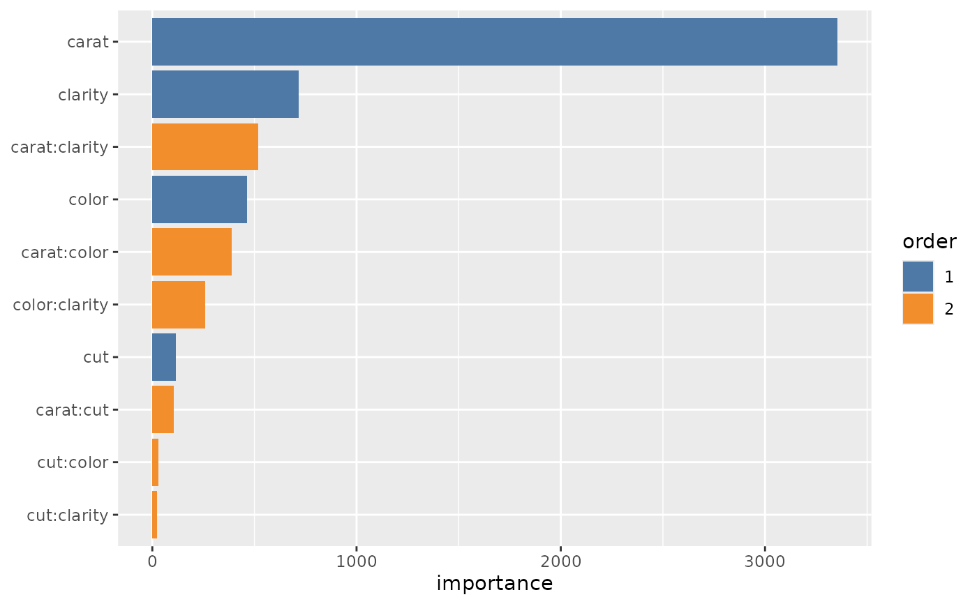
The default, type = "barplot", creates a standard bar plot where the length of each bar represents the overall importance of the term.
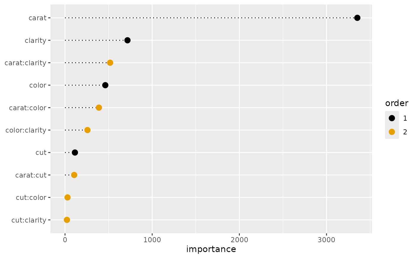
The type = "dotchart" option creates a dot plot, offering a clean alternative to the bar plot for visualizing term importance.
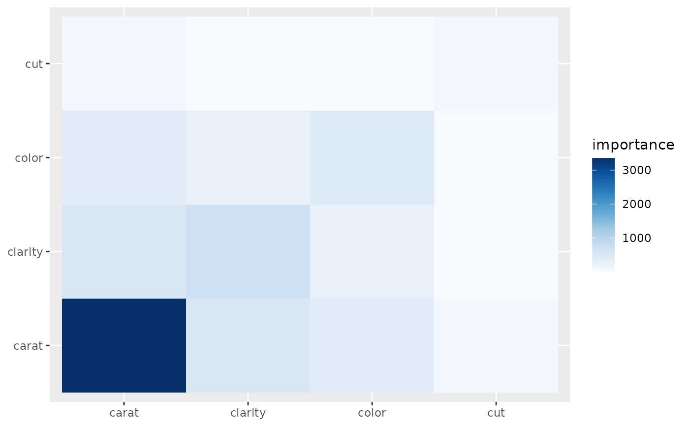
The type = "heatmap" option creates a matrix-shaped heat map where the color of each cell represents the importance of the interaction between a pair of variables, or the main effect on the diagonal.
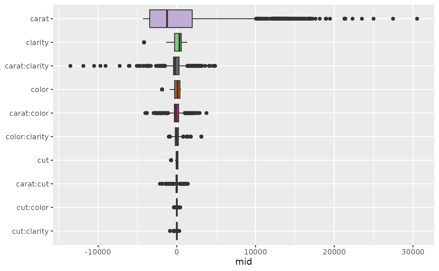
The type = "boxplot" option creates a box plot where each box shows the distribution of a term's contributions across all observations, providing insight into the variability of each term's effect.
Examples
data(diamonds, package = "ggplot2")
set.seed(42)
idx <- sample(nrow(diamonds), 1e4)
mid <- interpret(price ~ (carat + cut + color + clarity)^2, diamonds[idx, ])
#> 'model' not passed: response variable in 'data' is used
imp <- mid.importance(mid)
# Create a bar plot (default)
ggmid(imp)
 # Create a dot chart
ggmid(imp, type = "dotchart", theme = "Okabe-Ito", size = 3)
# Create a dot chart
ggmid(imp, type = "dotchart", theme = "Okabe-Ito", size = 3)
 # Create a heatmap
ggmid(imp, type = "heatmap")
# Create a heatmap
ggmid(imp, type = "heatmap")
 # Create a boxplot to see the distribution of effects
ggmid(imp, type = "boxplot")
# Create a boxplot to see the distribution of effects
ggmid(imp, type = "boxplot")