For "mid.breakdown" objects, plot() visualizes the breakdown of a prediction by component functions.
Arguments
- x
a "mid.breakdown" object to be visualized.
- type
the plotting style. One of "waterfall", "barplot" or "dotchart".
- theme
a character string or object defining the color theme. See
color.themefor details.- terms
an optional character vector specifying which terms to display.
- max.nterms
the maximum number of terms to display in the plot. Less important terms will be grouped into a "catchall" category.
- width
a numeric value specifying the width of the bars.
- vline
logical. If
TRUE, a vertical line is drawn at the zero or intercept line.- others
a character string for the catchall label.
- label.pattern
a character vector of length one or two specifying the format of the axis labels. The first element is used for main effects (default
"%t = %v"), and the second is for interactions (default"%t:%t"). Use"%t"for the term name and"%v"for its value.- format.args
a named list of additional arguments passed to
formatfor formatting the values. Common arguments includedigits,nsmall, andbig.mark.- ...
optional parameters passed on to the graphing function. Possible arguments are "col", "fill", "pch", "cex", "lty", "lwd" and aliases of them.
Details
This is an S3 method for the plot() generic that produces a breakdown plot from a "mid.breakdown" object, visualizing the contribution of each component function to a single prediction.
The type argument controls the visualization style.
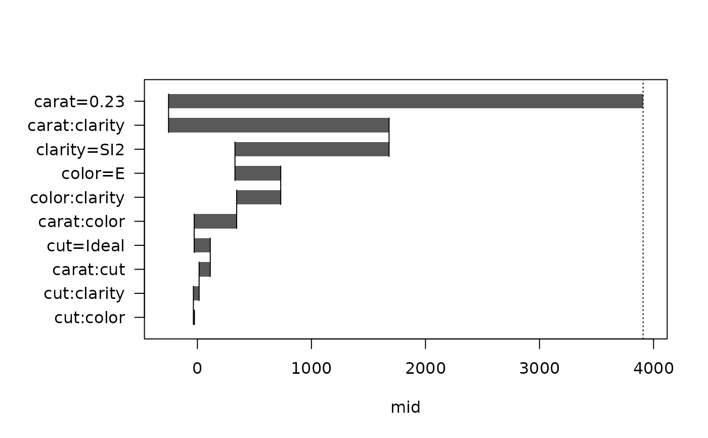
The default, type = "waterfall", creates a waterfall plot that shows how the prediction builds from the intercept, with each term's contribution sequentially added or subtracted.
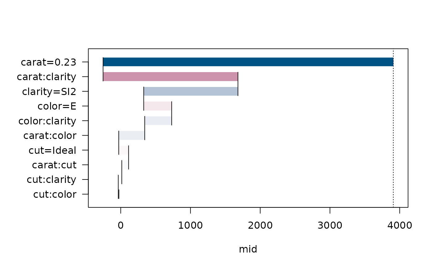
The type = "barplot" option creates a standard bar plot where the length of each bar represents the magnitude of the term's contribution.
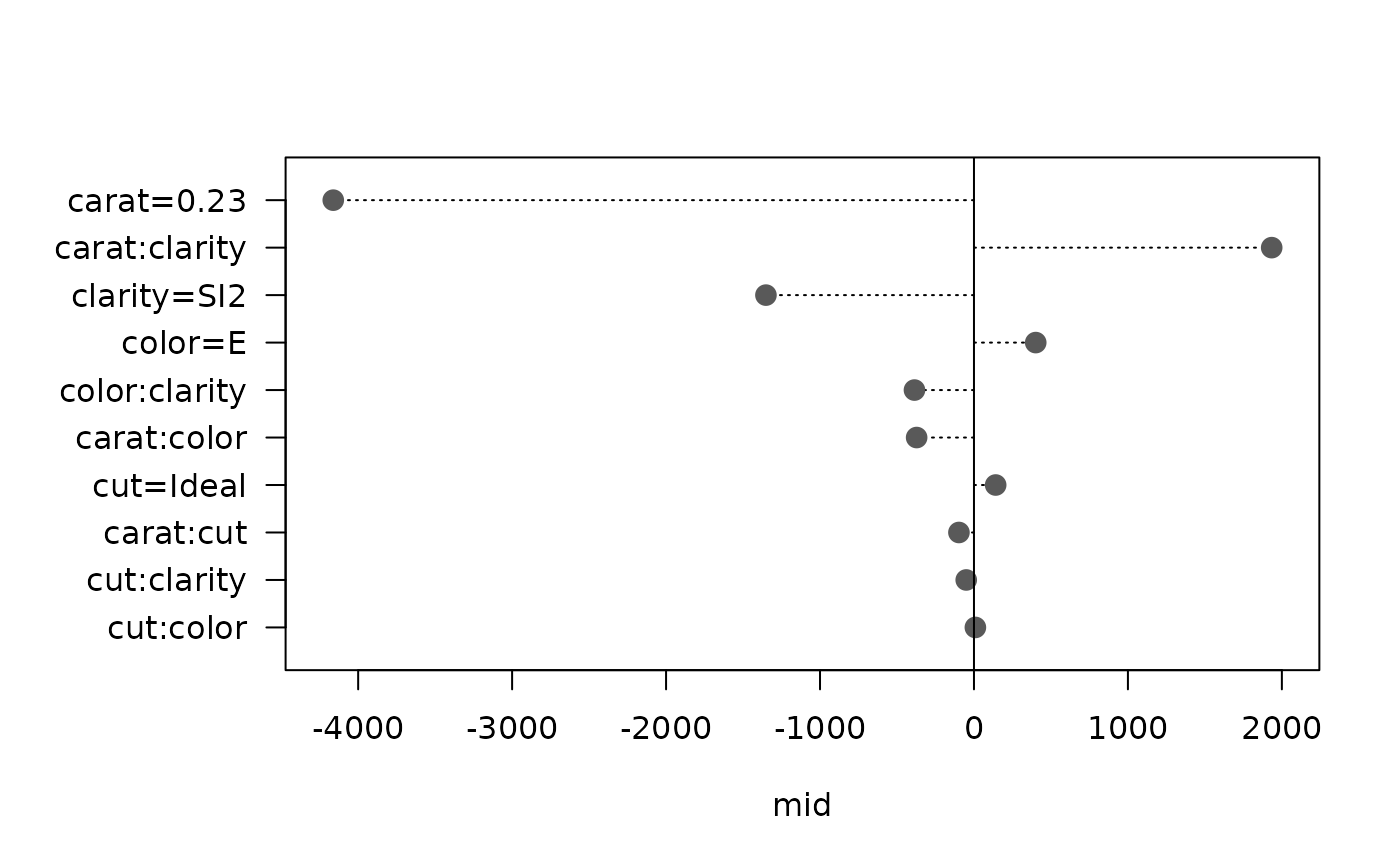
The type = "dotchart" option creates a dot plot showing the contribution of each term as a point connected to a zero baseline.
Examples
data(diamonds, package = "ggplot2")
set.seed(42)
idx <- sample(nrow(diamonds), 1e4)
mid <- interpret(price ~ (carat + cut + color + clarity)^2, diamonds[idx, ])
#> 'model' not passed: response variable in 'data' is used
mbd <- mid.breakdown(mid, diamonds[1L, ])
# Create a waterfall plot
plot(mbd, type = "waterfall")
 # Create a bar plot with a different theme
plot(mbd, type = "barplot", theme = "highlight")
# Create a bar plot with a different theme
plot(mbd, type = "barplot", theme = "highlight")
 # Create a dot chart
plot(mbd, type = "dotchart", size = 1.5)
# Create a dot chart
plot(mbd, type = "dotchart", size = 1.5)