For "mid.importance" objects, plot() visualizes the importance of component functions of the fitted MID model.
Arguments
- x
a "mid.importance" object to be visualized.
- type
the plotting style. One of "barplot", "dotchart", "heatmap", or "boxplot".
- theme
a character string or object defining the color theme. See
color.themefor details.- terms
an optional character vector specifying which terms to display.
- max.nterms
the maximum number of terms to display. Defaults to 30 for bar, dot and box plots.
- ...
optional parameters passed on to the graphing functions. Possible arguments are "col", "fill", "pch", "cex", "lty", "lwd" and aliases of them.
Details
This is an S3 method for the plot() generic that produces an importance plot from a "mid.importance" object, visualizing the average contribution of component functions to the fitted MID model.
The type argument controls the visualization style.
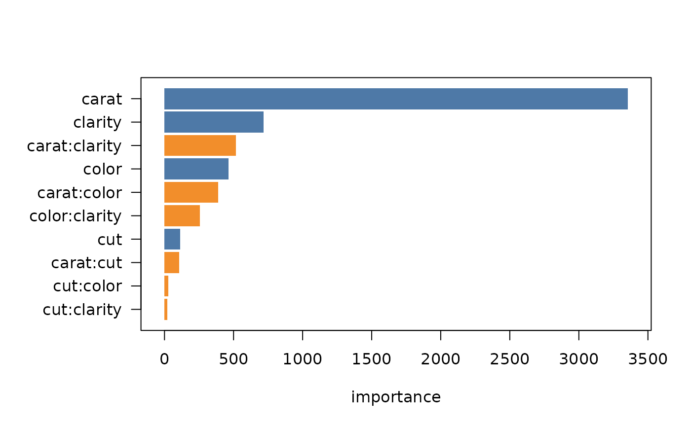
The default, type = "barplot", creates a standard bar plot where the length of each bar represents the overall importance of the term.
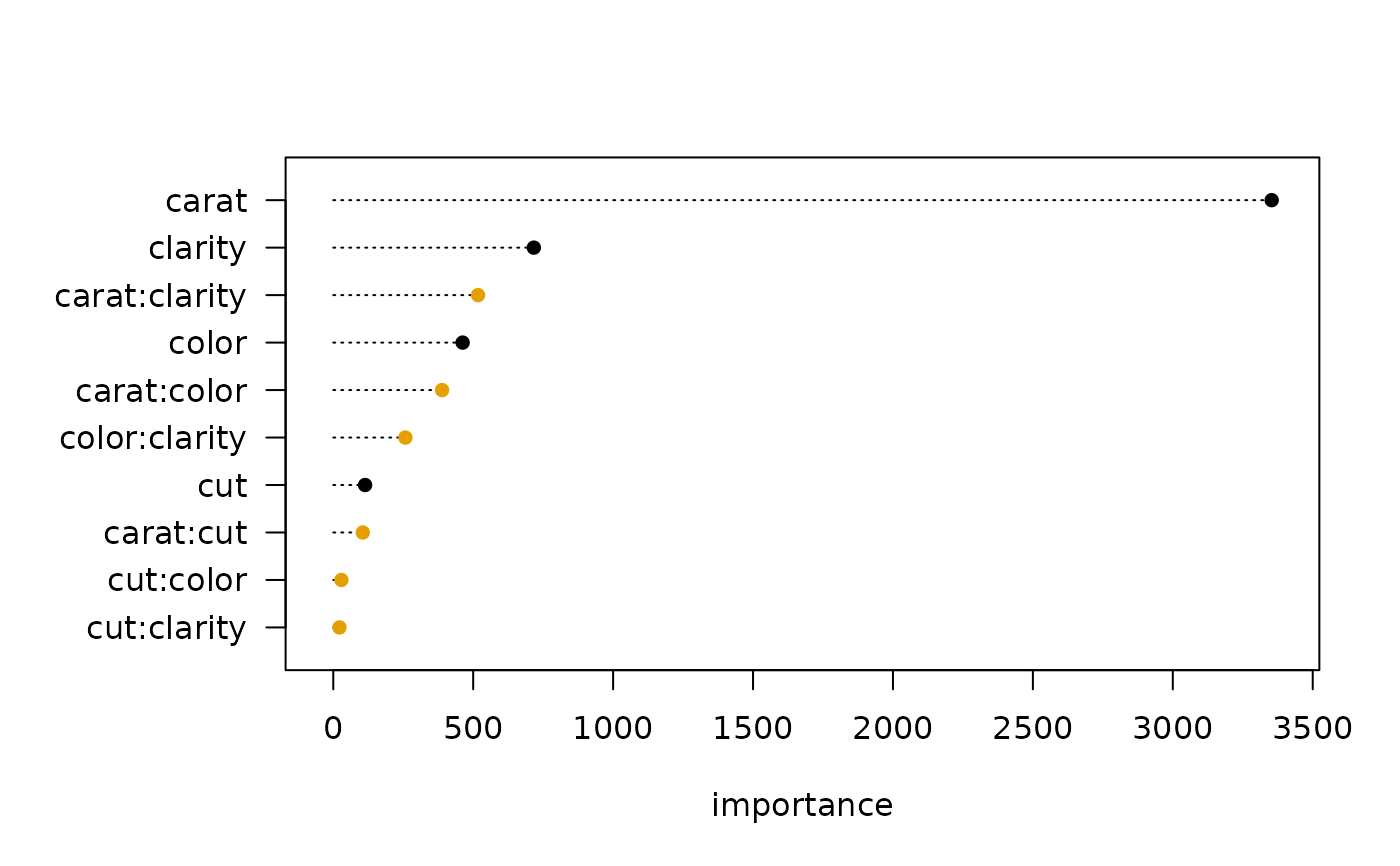
The type = "dotchart" option creates a dot plot, offering a clean alternative to the bar plot for visualizing term importance.
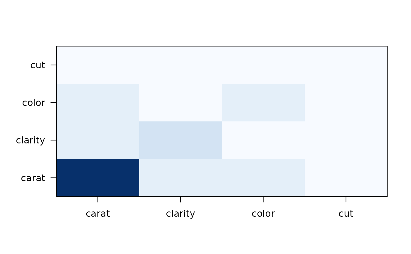
The type = "heatmap" option creates a matrix-shaped heat map where the color of each cell represents the importance of the interaction between a pair of variables, or the main effect on the diagonal.
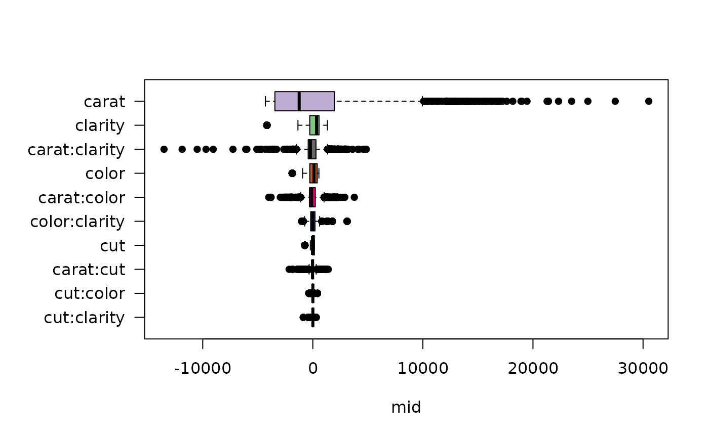
The type = "boxplot" option creates a box plot where each box shows the distribution of a term's contributions across all observations, providing insight into the variability of each term's effect.
Examples
data(diamonds, package = "ggplot2")
set.seed(42)
idx <- sample(nrow(diamonds), 1e4)
mid <- interpret(price ~ (carat + cut + color + clarity)^2, diamonds[idx, ])
#> 'model' not passed: response variable in 'data' is used
imp <- mid.importance(mid)
# Create a bar plot (default)
plot(imp)
 # Create a dot chart
plot(imp, type = "dotchart", theme = "Okabe-Ito", size = 1.5)
# Create a dot chart
plot(imp, type = "dotchart", theme = "Okabe-Ito", size = 1.5)
 # Create a heatmap
plot(imp, type = "heatmap")
# Create a heatmap
plot(imp, type = "heatmap")
 # Create a boxplot to see the distribution of effects
plot(imp, type = "boxplot")
# Create a boxplot to see the distribution of effects
plot(imp, type = "boxplot")