For "mid.breakdown" objects, ggmid() visualizes the breakdown of a prediction by component functions.
Usage
# S3 method for class 'mid.breakdown'
ggmid(
  object,
  type = c("waterfall", "barplot", "dotchart"),
  theme = NULL,
  terms = NULL,
  max.nterms = 15L,
  width = NULL,
  vline = TRUE,
  others = "others",
  label.pattern = c("%t=%v", "%t:%t"),
  format.args = list(),
  ...
)

# S3 method for class 'mid.breakdown'
autoplot(object, ...)
Arguments
- object
a "mid.breakdown" object to be visualized.
- type
the plotting style. One of "waterfall", "barplot" or "dotchart".
- theme
a character string or object defining the color theme. See
color.themefor details.- terms
an optional character vector specifying which terms to display.
- max.nterms
the maximum number of terms to display in the plot. Less important terms will be grouped into a "catchall" category.
- width
a numeric value specifying the width of the bars.
- vline
logical. If
TRUE, a vertical line is drawn at the zero or intercept line.- others
a character string for the catchall label.
- label.pattern
a character vector of length one or two specifying the format of the axis labels. The first element is used for main effects (default
"%t = %v"), and the second is for interactions (default"%t:%t"). Use"%t"for the term name and"%v"for its value.- format.args
a named list of additional arguments passed to
formatfor formatting the values. Common arguments includedigits,nsmall, andbig.mark.- ...
optional parameters passed on to the main layer.
Details
This is an S3 method for the ggmid() generic that creates a breakdown plot from a "mid.breakdown" object, visualizing the contribution of each component function to a single prediction.
The type argument controls the visualization style.
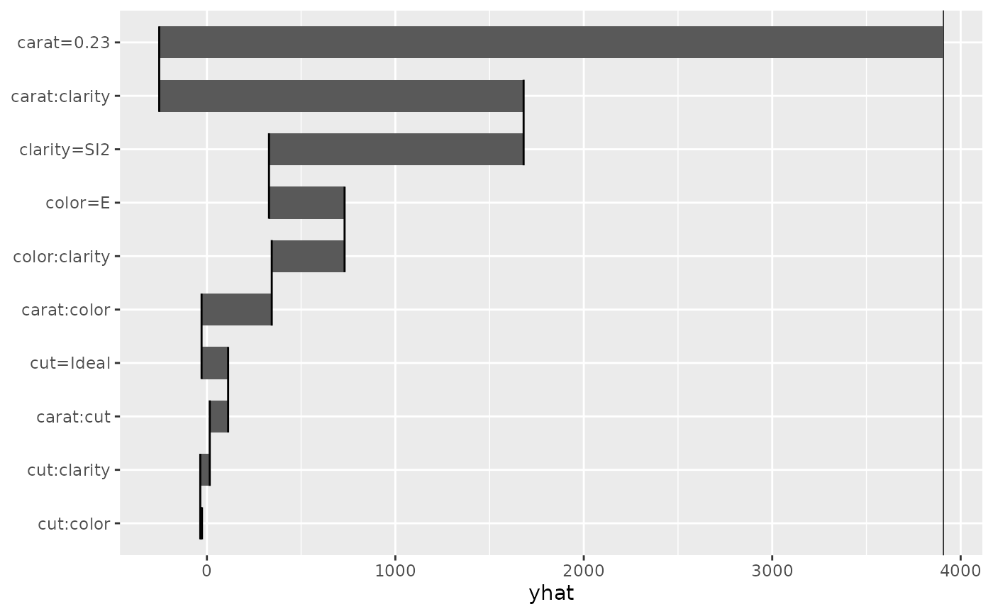
The default, type = "waterfall" (default), creates a waterfall plot that shows how the prediction is built up from the intercept, with each term's contribution sequentially added or subtracted.
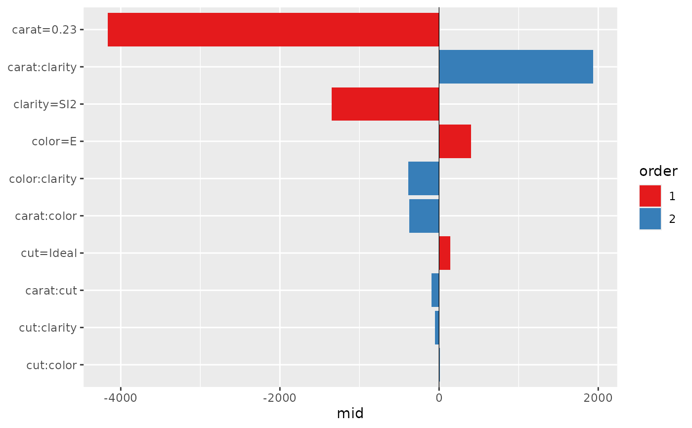
The type = "barplot" option creates a standard bar plot where the length of each bar represents the magnitude of the term's contribution.
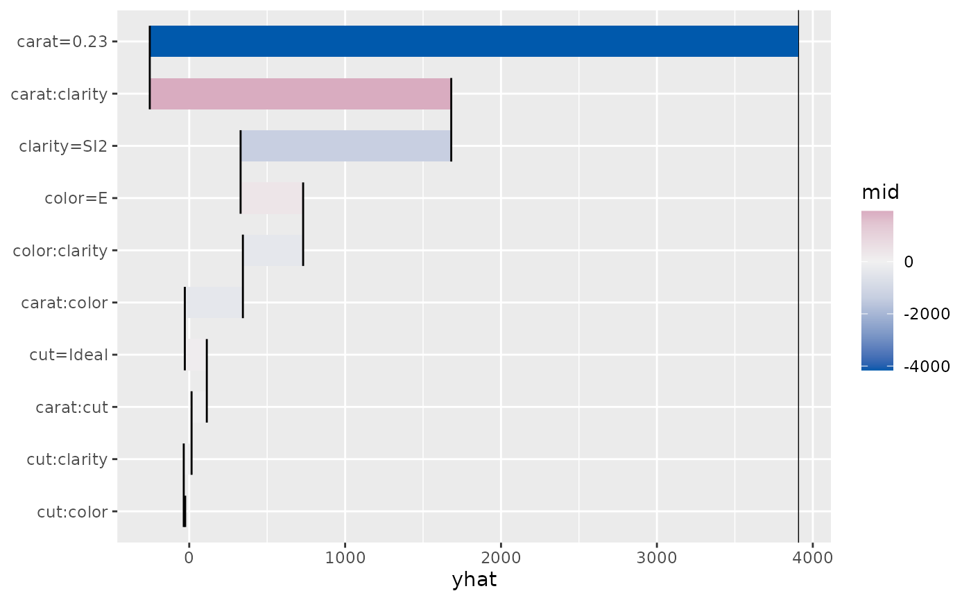
The type = "dotchart" option creates a dot plot showing the contribution of each term as a point connected to a zero baseline.
Examples
data(diamonds, package = "ggplot2")
set.seed(42)
idx <- sample(nrow(diamonds), 1e4)
mid <- interpret(price ~ (carat + cut + color + clarity)^2, diamonds[idx, ])
#> 'model' not passed: response variable in 'data' is used
mbd <- mid.breakdown(mid, diamonds[1L, ])
# Create a waterfall plot
ggmid(mbd, type = "waterfall")
 # Create a bar plot with a different theme
ggmid(mbd, type = "barplot", theme = "highlight")
# Create a bar plot with a different theme
ggmid(mbd, type = "barplot", theme = "highlight")
 # Create a dot chart
ggmid(mbd, type = "dotchart", size = 3)
# Create a dot chart
ggmid(mbd, type = "dotchart", size = 3)